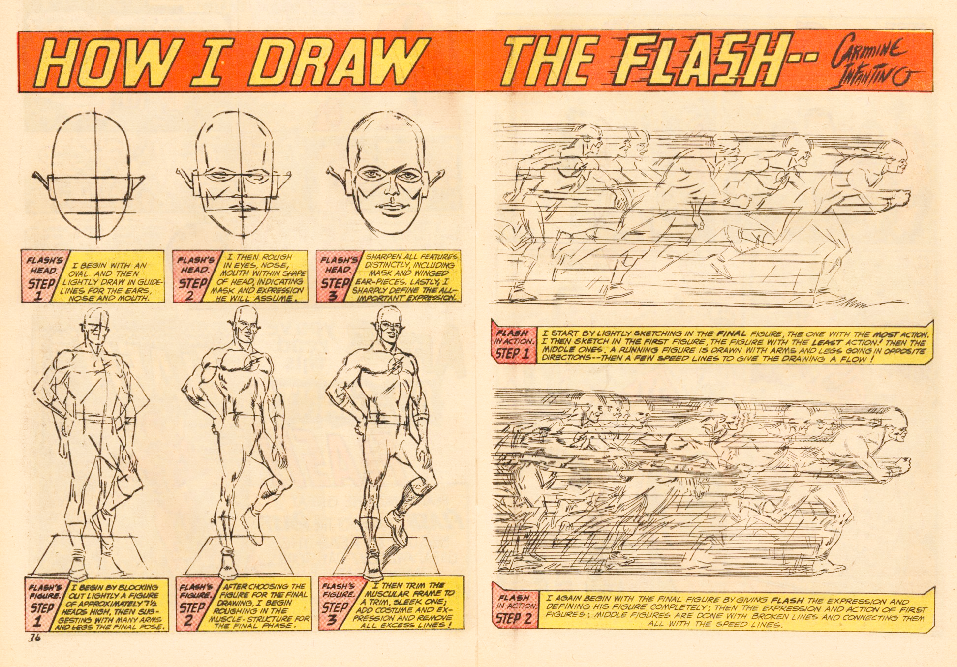
Si hablamos de un género literario tan restrictivo como el de los “Superhéroes” en los comics comerciales, un título como Flash (publicado por la editorial DC Comics) siempre ha presentado dentro de sus páginas tanto a elementos temáticos, argumentales y visuales que han empujado a esta narrativa secuencial hacia lugares inexplorados. Si miramos a detalle su acervo—el cual ya lleva más de 7 décadas de existencia—podemos decir que su época más formalista y desafiante a nivel de storytelling fue aquella ilustrada por el artista visual Carmine Infantino (1925-2013).

Los esfuerzos de Infantino (recuadro, arriba) fueron claves para dotar de vitalidad y novedad a un comic como Flash, haciéndolo un atractivo mashup de acción pulp como de divertida ciencia ficción. La composición de escenarios de gran audacia, ingeniosos efectos visuales y un approach hacia el realismo clásico, hicieron de este comic todo un hito en la historia moderna del comic norteamericano.
A continuación reproducimos un elocuente y experto ensayo visual por parte del crítico y artista Matt Séneca, quien desmenuzó los aspectos fundamentales que llevaron al talentoso Infantino hacia la cumbre del comic mainstream, y el legado que su obra le dejó al superhero comic; un lustre y frescura inusitado en una época que se caracterizó por la ausencia de riesgo y la autocensura a nivel editorial.
– – – – – – – – – –
Infantino’s Flash
Por Matt Séneca
Publicado originalmente en death to the universe at blogspot dot com el 26 de abril de 2011.
As readers of my comics know, Carmine Infantino is one of my favorite comics artists, as well as a big influence on my own comics work. I also think he’s a distressingly under-recognized presence in comics history, someone whose importance to mainstream/action comics is almost up there with Jack Kirby and Steve Ditko, and at the very least equals that of more talked about artists like Steranko, Gil Kane, or Neal Adams. Infantino is probably the representative artist of a lost chapter of comics history, the bland and traumatized years from 1955 to 1962 or thereabouts. Infantino did his best work during the time when the Kefauver hearings and subsequent dismantling of EC Comics had clear-cut the art form of anything that wasn’t good vs. evil action comics, teen laff books, or funny animals, and the Kirby-Ditko axis had yet to lead superhero comics into the Marvel Age renaissance. The undergrounds were at best a nagging idea in the back of Gilbert Shelton and R. Crumb’s adolescent brains. It was one of the few eras in comics history when a craftsman, rather than a visionary, could produce work with a legitimate claim to being the most interesting stuff out there.
Infantino’s early 1950s work runs a distinct second-best to the ECs, and once the Marvel artists get going in the mid ’60s it pales in comparison again. But in that underfed middle stretch, he was the best of a bad lot. That might be a dubious claim to comics greatness, but Infantino’s comics are great on their own merits, no doubt about it. It’s just a quieter greatness than that of Kirby or Wally Wood or Harvey Kurtzman, an uninterrupted grace and clarity of vision that elevates workaday comics into isolated moments of sublimity. The other artist who worked in this unobtrusive mode during the same period was Alex Toth, the “artist’s artist” of comics, whose mastery of craft surpassed even Infantino’s. As a maker of pure comics art, Toth has the better case as the midcentury lull’s leading light. But the stories he drew were simply the same old thing done up to perfection, juvenile war or romance stories reframed for the trillionth time, definitive readings of material that really didn’t deserve them. Infantino, however, worked in superheroes during the ten-plus years or so when that idiom possessed the real energy and excitement in comics, when their shared universes were expanding by the page and nothing was solid yet, when formal possibilities were being torn into more than explored, when a generation of artists who could have made truly great work were pressed into the service of a few million child readers, and vented their frustrations by producing some of the greatest fantasy stories of the 20th century.

Infantino’s work has that energy to it, the feeling that no one had ever drawn these things before. His long run on the Flash kicked off the superhero revival of the ’50s and ’60s, its first few years laying the path from the crude, hyperbolic Golden Age superhero comics of the WWII era to the relatively subtle, nuanced material that is the best of ’60s Marvel. He is how superheroes got from there to here, from their generally recognized Point A to their Point B. His historical value is undeniable. Those Flash comics, while they never quite transcend their genre like Fletcher Hanks’ wild early superhero death-fests or Kirby at his biblical best, are still something quite wonderful: superhero comics being the best they can be without becoming anything else. They aren’t modern myths or outsider art, they’re only entertaining stories of men in colorful costumes struggling for power or money or justice. But with the formal skill, the sheer wealth of drawing talent, and the lively tone Infantino brought to these stories, that feels like more than enough.
 These Flash comics are some of my favorites of all time, maybe even the ones I come back to most often. That said, they’re singularly difficult to make a critical case for as stories—simplistic, nonsensical kid stuff that hardly display any consciousness that they could be anything but what they are, let alone make the attempt. Their charm is in their whimsical daffiness, a tone that it seems has been irretrievably lost to comics despite its long and storied history as a part of the medium. Infantino’s Flash feels like a final progression from the dreamlike, logic-light great early newspaper strips, where the drawings dictated the plots and color and form took precedence over sensicality and impact. These stories (collected in the generally excellent Flash Chronicles paperbacks) are strung along by Infantino’s gentle virtuosity, subtle acts of inspired picture-making that always serve the strange, childlike narratives but carry a surprising power when they’re considered as art for art’s sake. That isn’t how you’re supposed to read these comics, and that’s why they’ll never be held in the esteem that the best of Kirby or Winsor McCay is—but the drawings are there, the power is there, and digging it out is one of the purer joys reading comics can offer.
What follows is a gallery of some of my favorite Infantino Flash panels and sequences, presented with a little commentary to keep things interesting.
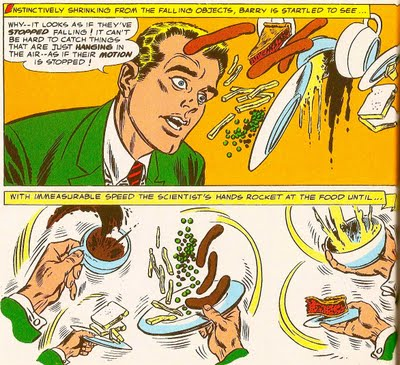
This sequence comes just when police scientist Barry Allen is realizing he’s been imbued with the superspeed powers of the Flash. I always thought the fact that the character perceived time as moving really slowly was may more interesting than the fact that he could run real fast. Infantino didn’t get as much artistic mileage out of that slowed-down perception of time as he did out of pure speed lines, which he is basically the king of for ever, but he did some cool figure animation stuff with it, not to mention more interesting gestural motion-tracking like the bottom three panels. It’s that top panel that really jumps out, though. The surrealistic, Magrittesque composition is unforgettable, but as notable is Infantino taking the opportunity to use the panel as a frozen moment, an actual frozen moment in time. Of course, given that no printed comics panel can actually move that’s technically what they all are, but action comics are so invested in moving readers from panel to panel that you see a frame with no motion even being suggested, everything completely still in the middle of what it’s doing. This panel does that, and then the speedy bit of animation underneath it just blasts out at you, selling the Flash’s uncanny speed perfectly.
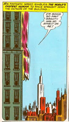
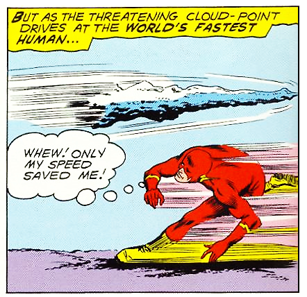
Here’s another interesting, unconventional approach to depicting speed and motion. There’s speed lines to it, sure, but that doesn’t go too far with such a tiny figure. What really gets the picture working is the dizzying vertical orientation of Infantino’s cityscape, like a hive of needles stabbing at the sky, everything in it leading from up to down in the exact same direction as the Flash. With such an abstracted figure the eye is pulled into that little cluster of architectural drawings, but it finds no relief there; everything in it is designed to hurl you downward at breakneck speed. Note also the curved corners at the bottom of the panel (in contrast to the top), which create a bullet shape, suggesting that the frame’s being pushed downward by the force of the Flash’s movement. It’s all topped off with a wonderfully explanatory courtesy of writer Robert Kanigher, a superspeed exclamation that puts across a concept no drawing could. Infantino’s picture, rather than trying to depict what’s in the words, creates a perfect compliment to it.

A lot of good things happening on this page. Infantino’s landscapes always really call to me—he grounded his action not in the grimy cityscapes of the Marvel artists, nor the clean, pop-art suburbs and main drives of DC stalwarts like Curt Swan and Dick Sprang. With Infantino a sprawling metropolis is always in view, a collection of black rectangles dotting the horizon, but the arena for the story happenings is more often some lush, green fantasy space, a park or stretch of unincorporated land on the outskirts of the city. It’s an ideal environment for action stories: an open space for figures to move dynamically through, but one where the instant recognizability of city skylines still holds sway. The first and last panels here are prime examples of the typical Infantino setting.
That second panel is one of the quietly brilliant moments I was talking about. Infantino didn’t drop his backgrounds a whole lot; even in the most kinetic fight scenes there’s always the token gesture of a horizon line or the wall of a building at the edge of the panel. Here, though, we move from present tense into a flashback, so Infantino dislocates us from the established “present” setting before showing us the past. Back in 1956 it was a given that a panel like this would be colored with a flat, bright single-tone background, something that would jar sufficiently to wrench the reader out of the flow they’re accustomed to. The Flash Chronicles reprint uses a deep scarlet, which clashes perfectly with the villain’s green and purple suit. It’s a pregnant moment that gets you subliminally excited to read what comes next.
Finally, I always find that fifth panel really interesting. The villain’s being rocketed to the past for his crimes by the future society he lives in—but as a simple depiction of crime and punishment, this sequence has a lot in common visually with an electric-chair execution. The villain sits helpless in the vehicle of his doom, and then suddenly he’s wrenched and illuminated as a surge of energy courses through him. The ECs, last year’s back issues at this point, had given the world more than one stellar electric-chair scene; I always wonder if Infantino had gotten hot to do one himself and this was his way of sneaking his version past the new Comics Code.

Infantino was a solid figure artist who ignored the rules of anatomy as often as any other pre-Image superhero draftsman you care to name. Especially in his action scenes, if the immediate hit of the panel’s content worked right, he rarely did much to create a believable sense of the characters’ physicality. It’s a comic book—the stuff doesn’t have to be “real”, it just has to “read”. Here, the Flash turns tiny for a second to dive through those heat rings, and then his legs and lower torso disappear as he tackles the scarecrow-limbed villain in the next panel. It’s all so easy to comprehend, though, that it isn’t immediately noticeable. You just go through it quickly, with no artistic showboating to slow you down. It’s a solid, interesting approach to making scenes that are supposed to be happening at superspeed, one that would be unlikely to work in a lot of other contexts but succeeds quite nicely here.
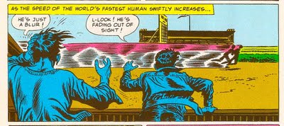
Another ingenious way of depicting superspeed. As we’re told, the Flash is moving so fast here he’s fading out of sight, which sounds awesome but isn’t much to look at. Infantino hits the final moment of the Flash’s visibility with a profusion of speed lines, but puts across the sense of unhinged motion with the posture of the figures in the foreground. Those loose-limbed, expressive poses get transposed onto the whole panel, and we get the sense that the Flash is barreling along wildly without actually seeing it.

This kind of atmospheric treatment of city-as-character, weather patterns-as-plotline is lifted pretty much directly from Will Eisner’s Spirit playbook, but Infantino’s crisp, relatively uninflected style (especially as inked by frequent collaborator Frank Giacoia) gives it a pretty different overall effect. Eisner’s expressive, fluid forms anthropomorphized everything he drew, from guns to trees to buildings; but when Infantino drew a city it was a city, pure and simple. The sense here is of massive forces interacting, not humanized edifices engaged in a plot. It’s remote, stoic in its beauty. It’s also a surprisingly quiet, deep note for an action story to hit—nothing kinetic or splashy here, just a slow cresting. Lovely.

God, I really can’t get enough of this guy’s city drawings. It’s interesting to note how far from the literal Infantino gets in his depiction of the Flash’s madcap search through his urban environment—this is simply not a picture of a man running along the ground. Speed lines are imposed over buildings, the path of movement flickers in and out of perspective, and it’s punctuated by a gargantuan figure hurtling through the rooftops. But as always with Infantino, it reads, an illustration that puts off an immediate impression, carries plenty of craft value for closer study… and then falls apart logically the second you consider it.

This sequence is just a phenomenal bit of moment-to-moment action comics storytelling. Look at how Infantino’s framing of it captures the most tense, dynamic view into the action possible again and again, from one panel to the next. The fluidity of the Flash’s body language as he edges out onto the tightrope up against the rigid implacability of the city below him, soft lines versus hard, curvy versus straight. It gets at the fundamental, nail-biting quality of seeing a tightrope walk (even in drawn, ink-on-paper form): not just man versus nature in the traditional sense, but man versus a natural law that by all odds should win out. That bit of solid black space at the edge of the panel to pull the eye into the next ones is an especially nice little touch. Then it’s the swinging-camera zoom in as the tightrope breaks, complimented by some body language that recalls nothing more than Steve Ditko’s acrobatic Spider-Man figures (look at the hands!).
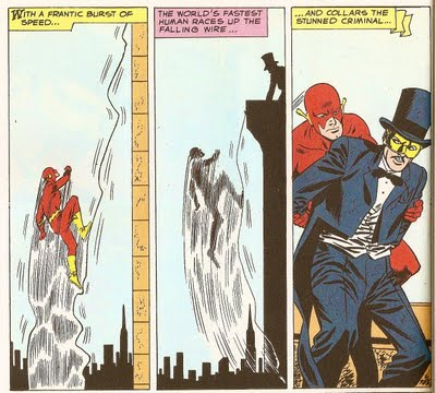
Then the Flash runs up the tightrope, with Infantino showing the burst of movement that begins the action, then freezing it midstream with a photographic-negative style silhouetted panel. It’s another still moment captured and taken out of time, any sense of movement or liveliness in the villain’s figure or the buildings denied by Infantino’s filling them in with blacks—but the Flash is going too fast to be caught by the “shutter” of Infantino’s drawing, and even his silhouette is bursting with speed lines. It’s a simple, highly intelligent way of indicating speed that goes far beyond the normal range.
 I include that top panel just because I want to talk about the bottom one. These two come at the bottom right of their page, the last two panels you read. Like I said before, Infantino hardly ever dropped his backgrounds, and when he did, it was always for dramatic effect. Here’s a good example of that effect—one hundred percent of the reader’s focus is drawn to the facial expressions over that transition, which are quite honestly stunning. Barry Allen (the Flash)’s face is a great bit of realist cartooning, the ultimate visualization of “bafflement” without becoming at all grotesque or un-anatomic; and his reporter girlfriend Iris West’s face is a mask of expectation, mysterious and rapturous. The lines radiating from the pupils of her eyes! It’s almost a transcendent moment, one in which the feeling put off by the panel not only outstrips the story content it has a basis in, but doesn’t even mirror it very much. These are the faces of people about to receive final enlightenment, not solve a Scooby-Doo style mystery. Infantino’s organization of the figures within the panel is really quite unconventional, cutting off half of Iris’s face, unceremoniously shoving the reader’s eye to the veriest bottom right corner of the page, rudely forcing us to get to the next page quickly. It’s a manipulative way of getting the reader excited to see what comes next—usually when we hit a page transition that urgent it’s because the story is really cooking, but here Infantino does it all with composition, which is bound to produce some of the same feelings in the reader regardless of their engagement with the story. Now that’s what you call serving your script. Also: Iris is totally earning her “bitchiest superhero girlfriend” crown in that top panel, jeez.